Creating a serene and relaxing environment at home often starts with selecting the right colors. Calm colors can transform your living spaces into peaceful retreats where you feel comfortable and at ease. Whether you’re repainting a single room or decorating an entire home, choosing calming tones can influence your mood and overall well-being.
In this post, we’ll explore practical tips to help you pick calm colors for your home, covering color choices, combinations, and how to incorporate them effectively.
Why Choose Calm Colors?
Calm colors often consist of soft, muted shades that promote relaxation, reduce stress, and create a harmonious atmosphere. These colors are especially beneficial in areas meant for rest, such as bedrooms and living rooms, or places where you want to encourage focus and tranquility, like home offices.
Using calm colors can also make your space feel larger and more open, fostering a sense of balance throughout your home.
Understanding Color Psychology
Before selecting colors, it’s helpful to understand how different hues affect mood:
– Blues: Often associated with calmness and stability, blue tones can lower heart rates and help you feel relaxed.
– Greens: Symbolizing nature and renewal, green has a soothing effect and can reduce anxiety.
– Neutrals: Shades like beige, taupe, and soft grays provide a versatile, quiet backdrop that supports tranquility.
– Lavenders and Pastels: Light purples and other pastel tones can add a gentle touch of color while maintaining calmness.
Tips for Choosing Calm Colors
1. Start with Your Lighting
Lighting can dramatically impact how colors appear. Natural daylight tends to bring out the true nature of paint colors, while artificial light can change hues.
– Test paint samples both during the day and at night.
– Consider the direction your room faces; north-facing rooms receive cooler, less direct light.
– Use soft, warm lighting fixtures to complement your calm color palette.
2. Consider the Room’s Purpose
Different rooms have different requirements for color schemes:
– Bedrooms: Prioritize soothing cool colors like soft blues, gentle greens, or muted lavenders.
– Living Rooms: Neutral colors with subtle accents can create a relaxing yet sociable atmosphere.
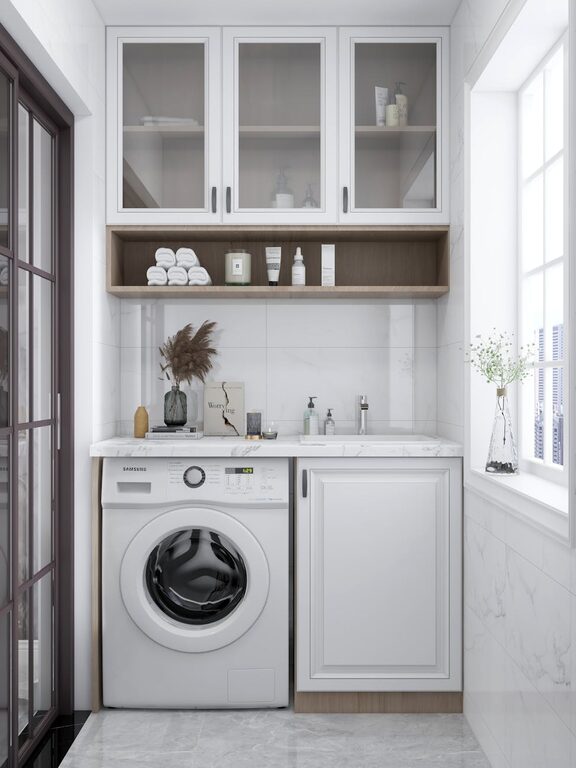
– Bathrooms: Light blues, greens, or soft grays work well to promote a spa-like feel.
– Home Offices: Neutral shades paired with a calming accent color can help maintain focus without strain.
3. Choose Muted and Soft Tones
Bright, saturated colors can be energizing but might work against creating a calm space. Instead:
– Opt for pastel versions of your favorite colors.
– Avoid overly dark shades that may feel heavy or gloomy.
– Consider paints with a matte or eggshell finish for a subtle, softer look.
4. Use Color Combinations Wisely
Combining colors can enhance calmness if done thoughtfully:
– Pair cool tones like blue with complementary neutrals.
– Use monochromatic schemes—different shades of the same color—for a harmonious effect.
– Incorporate natural textures such as wood or stone to balance and enrich your color choices.
5. Test Before Committing
Paint large swatches on your walls or use sample boards to see how colors work throughout the day. This allows you to:
– Observe changing light conditions.
– Decide how the color affects the mood of the room.
– Make adjustments before painting the entire space.
6. Don’t Forget Accents and Accessories
Calm colors aren’t just for walls—furnishings, curtains, rugs, and artwork all contribute to the overall feel:
– Add throw pillows or blankets in soft blues or greens.
– Choose curtains in sheer neutral fabrics to let light in softly.
– Opt for wooden or natural fibers that complement your palette.
7. Keep It Simple
Too many colors or complex patterns can disrupt a calm space:
– Limit your color palette to two or three harmonious shades.
– Use neutral base colors and add interest with small accent pieces.
– Embrace minimalism to allow your calm colors to shine.
Popular Calm Color Choices
Here are some classic calm colors to inspire you:
– Soft Blue: Sky blue, powder blue, or pale teal.
– Sage Green: A muted green that’s earthy and comforting.
– Warm Gray: Gentle gray tones with warm undertones.
– Creamy Beige: Provides warmth without overwhelming brightness.
– Lavender Mist: A very light purple with subtle floral notes.
Final Thoughts
Choosing calm colors for your home is a rewarding process that enhances comfort and relaxation. By understanding how colors affect mood, considering your space’s purpose, and testing your choices, you can create a home environment that feels peaceful and welcoming.
Remember, the best color for your home is one that makes you feel at ease every time you walk through the door. Start experimenting with soft tones, and enjoy the tranquil ambiance they bring to your living spaces.